 Written by System Administrator, Apr 2026
Curiosity is an innate human trait. Most people are piqued by visual information, but many crave a deeper understanding of their surroundings.
This is why an artist statement is so important. It should be a clear and straightforward explanation of your work, highlighting your motivations, inspiration and methods.
Artist statements peel away the surface and enable your audience to access the story behind your art, inviting a more intimate connection, analysis and appreciation of your creative intentions.
Zesty text can also boost artwork sales, break a tie in an art prize, or secure your spot in an exhibition.
So, how do you write one?
Organise your information
Using simple, accessible layers to guide your artist statement helps to hone in on relevant information. Your audience doesn’t need to know how many hours it took you to set up your studio, or where you purchased your materials from.
Start by noting the key components of your work. These can be visual or conceptual.
Then, arrange this information in the following format — topic, theme, message — and write your artwork description from this.
Let’s say you crafted a textile piece using cotton. You’ve established that this material is paramount to your artwork. Organising this information could look like:
Topic: Cotton
Theme: I used cotton because it’s a universal (its significance) and sustainable (its expense) fibre that can be dyed in many ways (its appearance).
Message [when my audience reads my artwork description, they will know…]: Cotton is one of the world’s most important crops that has been used continuously since ancient times.
Write for your audience
According to the Australian Bureau of Statistics, over 69% of Australians aged 20-64 have a higher education qualification. Your audience is likely well educated, but not experts in the artistic style or subject you’re working with.
The best way to ensure your artist statement is accessible is to establish who you’re talking to and craft your communication accordingly.
Imagine you’re walking through an exhibition. You’re reading this excerpt next to an elderly lady and a small child.

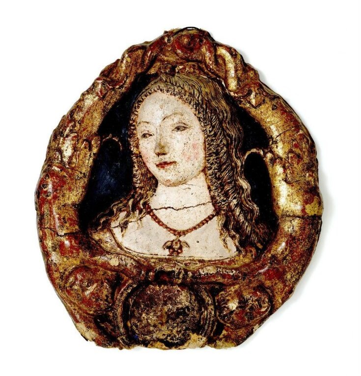
Photo: V&AM.
Neroccio de Landi
Mirror Frame, c. 1475-1500
Cast in painted papier mache
45.7 x 41.6 x 5.2cm
From the Victoria and Albert Museum
I was inspired by mirror frames that were manufactured in Siena during the last quarter of the fifteenth century. My artwork illustrates an emblematic female head. Neroccio dei Landi, who trained under Vecchietta and was active in Siena both as a painter and sculptor, was a big influence on my artistic approach.
Confused? The elderly lady is scratching her head, and the small child has already moved on to another artwork.
Even though the sentences are very long and wordy, there’s still so much vital information missing. Why is it called a mirror frame when it doesn’t have a mirror, nor does it look like a frame? What’s an emblematic female head? Who is Vecchietta, and why is he important?
Here’s a revised version:
My artwork takes inspiration from mirror frames; a popular type of Italian domestic furnishing. These were produced in the fifteenth and sixteenth centuries in the Tuscan region. The mirror, which is now missing, would have been a disc of blown glass or polished metal. As well as being an expensive novelty, mirrors were thought to reveal the inner truth. Long-established theories of optics describe how the eye receives impressions from the objects it gazes upon. Since beauty was thought to be a sign of virtue, my artwork invites a moral comparison. The viewer’s face appears below the beautiful - and thus virtuous - image above, inspiring the viewer to virtue. [108 words]
Write as you would speak
Your artist statement is your conversation with your audience. It should be written in first person.
When you’re conversing with a friend, you’re unlikely to bore them with an essay about your art. It’s the same with your artist statement. Keep it to a maximum of 200 words.
Engage with your work
Inspire your viewer to wander.

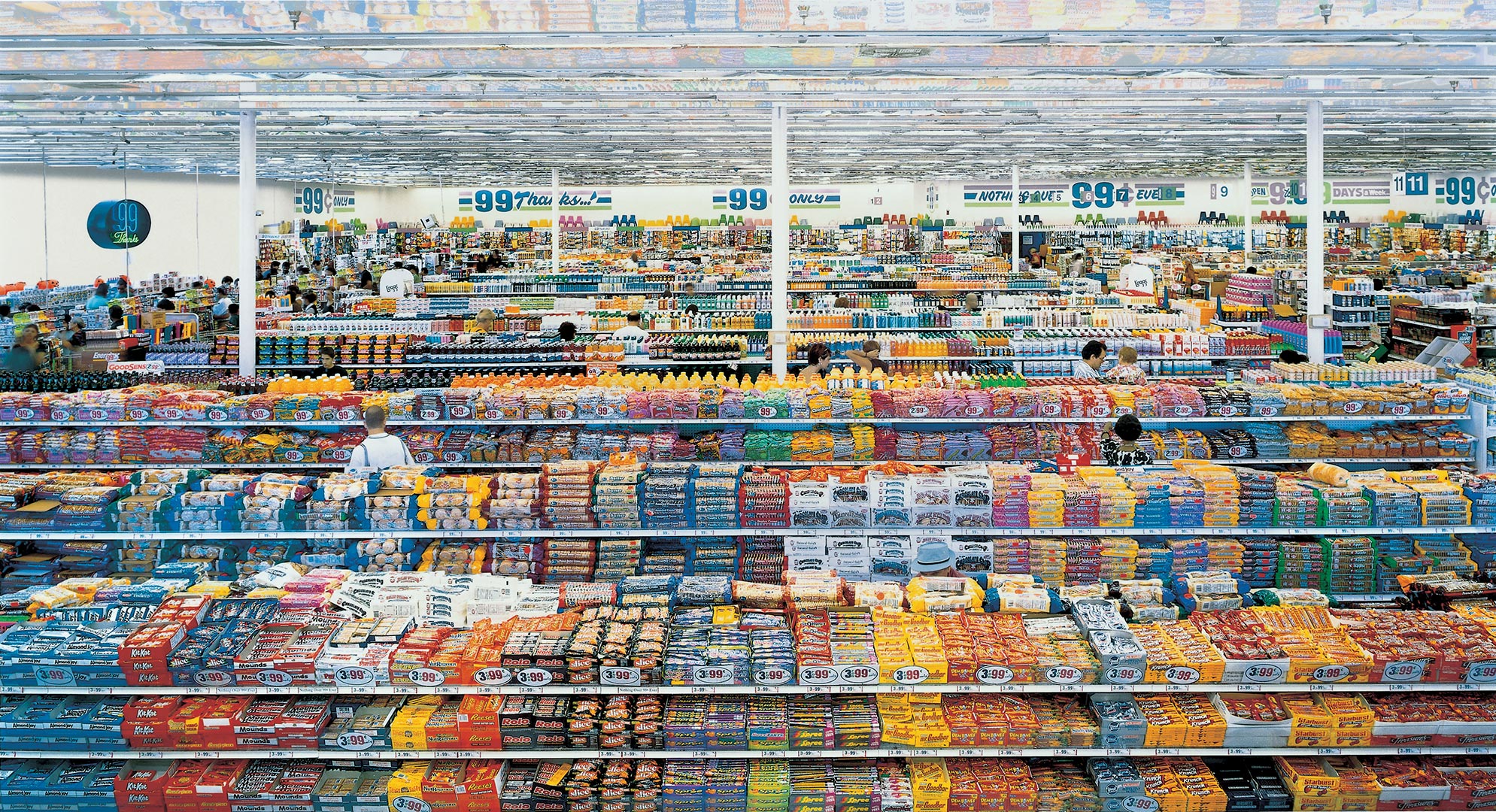
Photo: Time.
Andreas Gursky
99 Cent II Diptychon, 2001
C-print mounted to acrylic glass
207 x 307cm
This photograph by Andreas Gursky is beautiful. Immediately, our eyes are drawn to the kaleidoscope of colour and texture, and the organised monotony of the merchandise is oddly comforting.
Its surface has captured our attention, but look deeper into the image. Did you notice that there’s no depth of field in this photograph? Everything — even the products right at the very back — are sharp and in focus. Highlighting an element that’s overlooked or obscure in your artist statement packs a punch and keeps your audience engaged.
Remember George Orwell’s six rules for writing
And continue practising and refining your artist statement. Above all, enjoy the process!